Unpopular Opinion: Pantone Got It Right.
I know it’s controversial, but I’m absolutely one of those people who will die on the hill that white is a colour. And as someone who loves neutrals - truly loves them - you will never catch me living in a colour-drenched room. That said, here’s my take.
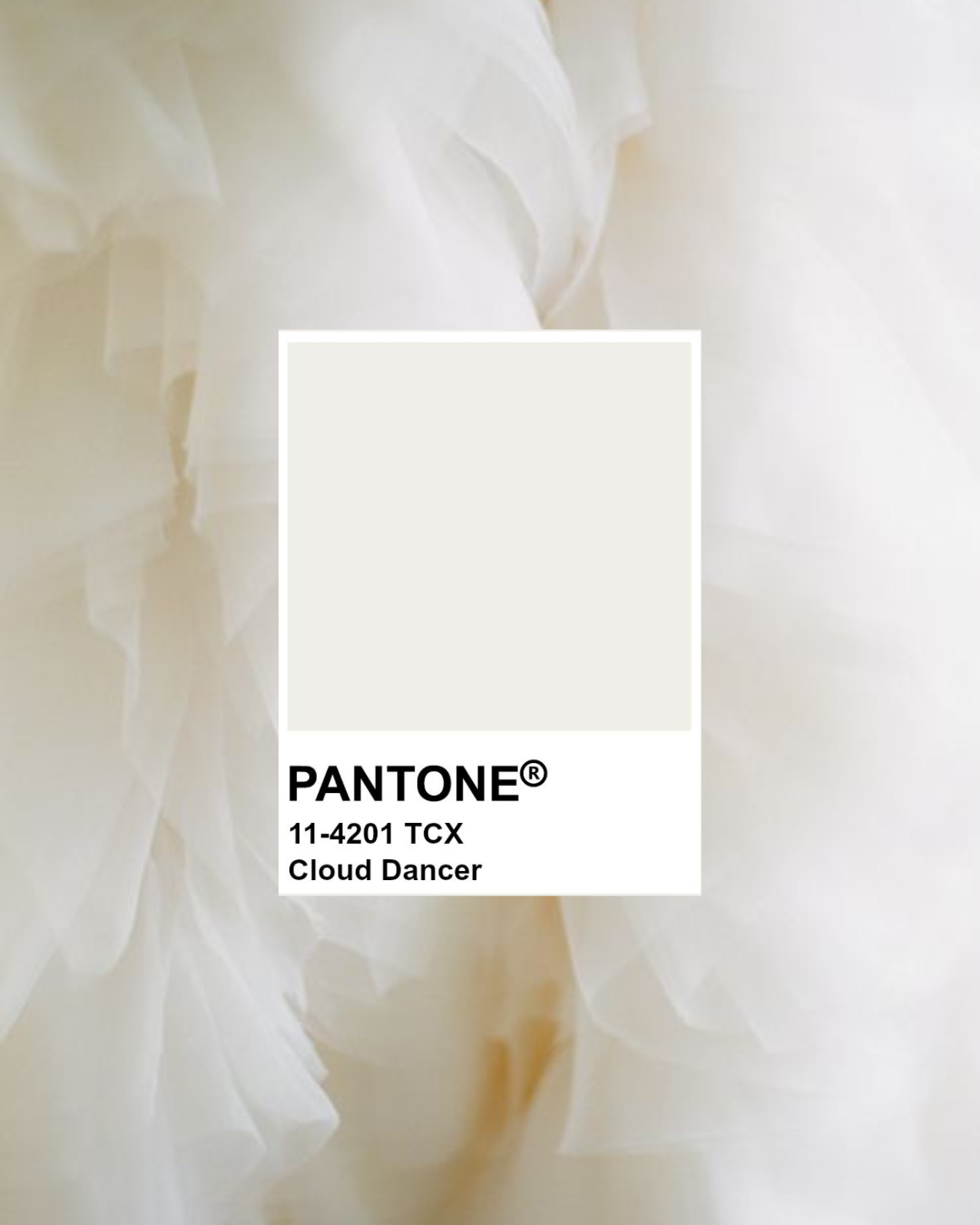
Choosing such a neutral (not warm, not cool, not bold) as Colour of the Year feels like a statement. It’s almost Pantone saying: here’s your baseline, now take it and make what you will.
To me, Cloud Dancer puts the attention back on silhouette, shape and texture. It asks us to notice the object, the form, the craftsmanship - instead of relying on colour to carry the story. After such a manic decade of “more, more, more”… consumerism, tech shifts, AI, maximalism - this choice feels like a large exhale. A pause. A bit of stillness.
It’s calm without being boring, and grounding without being heavy.
And the name “Cloud Dancer”. Yes, Pantone does everything with intention, but I love interpreting it my own way: look up at a cloud. It’s not a stark, flat white. It’s milky, soft, airy, almost like linen or unglazed porcelain. Organic, inviting and not loud.
So if anyone says “white isn’t a colour” or “white is boring” I’d argue they’re missing the point… and the depth.
A quiet choice for 2026, but a beautiful one, and one with endless room to create.
Thoughts?